
GSP Design Systems for NBCUniversal, Joint Component Library
2021 – Ongoing | Status: In Progress
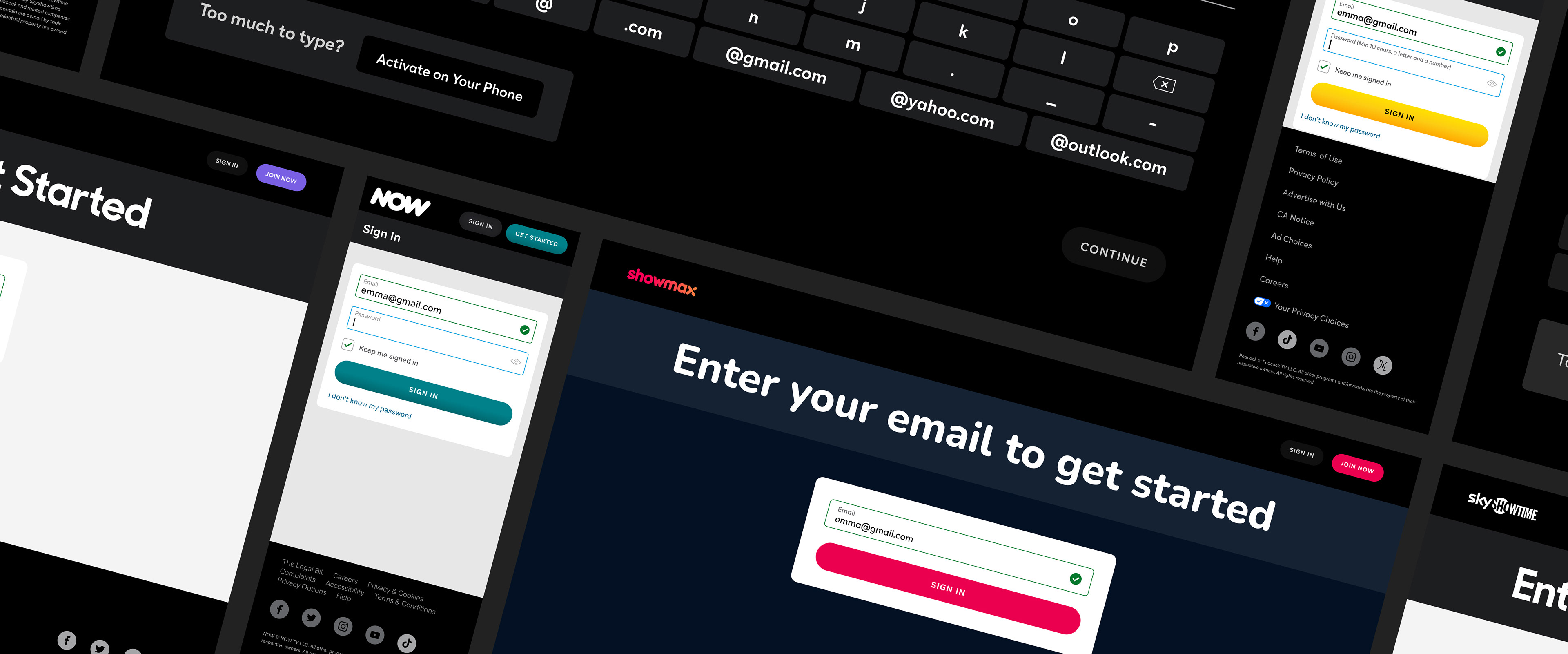
Brands PeacockTV (United States, SkyShowtime (Europe), ShowMax (Africa), NOW TV (Europe)
Role & Contribution Served as a Designer on the GSP (Global Streaming Platform) Design System initiative, collaborating with Commerce and Viewing Product Designers across NBCUniversal. This project aimed to standardize and improve design practices for various domestic and international propositions, including PeacockTV, SkyShowtime, ShowMax, and NOW TV. Additionally, enforced design best practices for members of the Product Design team for Web and Client applications, while simultaneously creating standards and eliminating inconsistencies between Commerce and Viewing.
Teammates Sean Cooley, Jacquelyn Zen, Emma Tak, Henry Gomes, Shamar Joseph, Matt Denton, Andrew Corrica, Jenny Du
Problem & Solution Initial efforts to unify the Commerce and Viewing teams for PeacockTV revealed significant opportunities for enhancing usability, design flow, components, and accessibility. As NBCUniversal expands internationally, a consistent design system became increasingly critical to providing designers and partners with the tools needed to build cohesive experiences across all of our brands. By developing standardized, yet flexible brand styles, components, and templates, we aim to empower product designers to solve problems more efficiently, reduce errors, and increase output.
2021 – Ongoing | Status: In Progress
Brands PeacockTV (United States, SkyShowtime (Europe), ShowMax (Africa), NOW TV (Europe)
Role & Contribution Served as a Designer on the GSP (Global Streaming Platform) Design System initiative, collaborating with Commerce and Viewing Product Designers across NBCUniversal. This project aimed to standardize and improve design practices for various domestic and international propositions, including PeacockTV, SkyShowtime, ShowMax, and NOW TV. Additionally, enforced design best practices for members of the Product Design team for Web and Client applications, while simultaneously creating standards and eliminating inconsistencies between Commerce and Viewing.
Teammates Sean Cooley, Jacquelyn Zen, Emma Tak, Henry Gomes, Shamar Joseph, Matt Denton, Andrew Corrica, Jenny Du
Problem & Solution Initial efforts to unify the Commerce and Viewing teams for PeacockTV revealed significant opportunities for enhancing usability, design flow, components, and accessibility. As NBCUniversal expands internationally, a consistent design system became increasingly critical to providing designers and partners with the tools needed to build cohesive experiences across all of our brands. By developing standardized, yet flexible brand styles, components, and templates, we aim to empower product designers to solve problems more efficiently, reduce errors, and increase output.

Process Overview
Building for Web and Client - Our Component Libraries
Our design system team meets weekly to identify and address areas for improvement. One such area, iconography, was a significant concern. Inconsistencies between Commerce and Viewing icons led to a fragmented user experience. To rectify this, we conducted an audit of 80 icons across three sizes (16x16, 24x24, 32x32) on web, client, and app. This revealed inconsistencies in weights and corner-radiuses, largely due to the previous practice of borrowing icons from external sources.
Building for Web and Client - Our Component Libraries
Our goal is to create a unified user experience across our web, client, and app streaming platforms. To achieve this, we've identified key areas for improvement, including:
- Standardizing design elements: Systematizing iconography, typography, brand color, buttons, and more.
- Improving design documentation: Creating comprehensive documentation for in-production designs.
- Enhancing Figma adoption: Providing education and training on using Figma as a design system tool.
By addressing these challenges, we can ensure a cohesive and consistent experience for our users across all platforms.
Brainstorm & Define- Standardizing design elements: Systematizing iconography, typography, brand color, buttons, and more.
- Improving design documentation: Creating comprehensive documentation for in-production designs.
- Enhancing Figma adoption: Providing education and training on using Figma as a design system tool.
By addressing these challenges, we can ensure a cohesive and consistent experience for our users across all platforms.
Our design system team meets weekly to identify and address areas for improvement. One such area, iconography, was a significant concern. Inconsistencies between Commerce and Viewing icons led to a fragmented user experience. To rectify this, we conducted an audit of 80 icons across three sizes (16x16, 24x24, 32x32) on web, client, and app. This revealed inconsistencies in weights and corner-radiuses, largely due to the previous practice of borrowing icons from external sources.
Design
After extensive collaboration, we deprecated obsolete icons, identified irregularities, and created a new library of 80 standardized icons. These icons were redesigned to ensure optimal centering, adherence to a 2px bounding box and stroke-width, and compatibility with various sizes.
Build, Test, & Review
Following stakeholder approval, we provided detailed specifications and guides for each icon to our web and client development teams. After thorough testing and feedback, these icons were integrated into our domestic and international platforms. Similar processes will be followed for other design system elements, ensuring compliance with brand and accessibility requirements
Screen Templates Built Utilizing Design System Best Practices & Components
Learnings & Reflections Despite being an ongoing project, the team has learned valuable lessons and continue to innovate. Over the past three years, we've refined our approach to building and curating our libraries and design system. To further enhance our efficiency, we plan to introduce PMO support and provide more comprehensive training for designers on Figma best practices. Additionally, we'll implement a detailed visual change-log to ensure timely communication and documentation of design system updates across NBCUniversal's streaming brands. One of our biggest challenges has been ensuring consistent adoption of the design system across all teams. To address this, we are currently in the stages of exploring adding design tokens and variables to our libraries. By centralizing design decisions and making them accessible to our designers and developers, we believe we can significantly reduce inconsistencies and streamline the design process across all teams and brands.